Ellucian
Higher education re-imagined
Task
Redesign key flows while building out a design system

Understand the current state of PowerCampus
After years of acquiring software to help institutions with tools to enable their students, faculty and staff to succeed, their software had become outdated. PowerCampus, a software part of their suite, utilized by smaller universities, was selected as the pilot to a digital transformation within Ellucian.
Product suite issues
Ellucian needed a refactor of their product suite. Some of the key problems across the board were:
- Inconsistencies between products
Users could expect to be productive when each product appeared and operated differently between each product. - Not responsive
- Outdated visual design and appears to be stuck in the 90’s
PowerCampus specific issues
The last time PowerCampus had gotten a refresh was many years back, and the experience had suffered greatly. Because the primary goal of PowerCampus was to reskin the entire product with the rebrand while outlining key flows to completely redesign, 5 core flows were chosen for their high impact in student usage as necessary to completely redesign:
- Dashboard/login
- Navigation
- Class registration
- Degree requirements
- Academic plan

Taking a look at the class registration flow
Arguably the most important flow in the student’s academic career, the class registration flow has been riddled with issues: no real information hierarchy, non-responsive (forcing students to register on their computers), weird interactions (ex: students place classes in a cart then “check-out” which is not a paradigm that students associate with class registration) and many other convoluted patterns that further confuse than clarify.
Looking at the existing flow
Search for the class via code or name
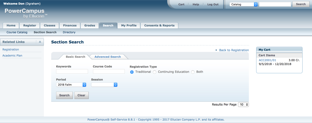
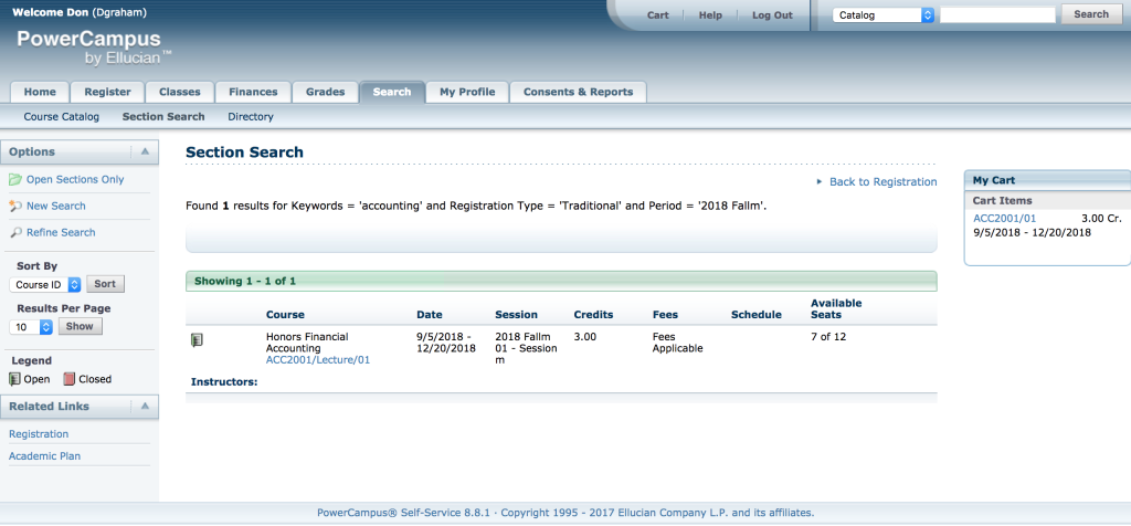
Select the specific class you want to take and add it to the cart
Confirm the period you are looking to take this class for
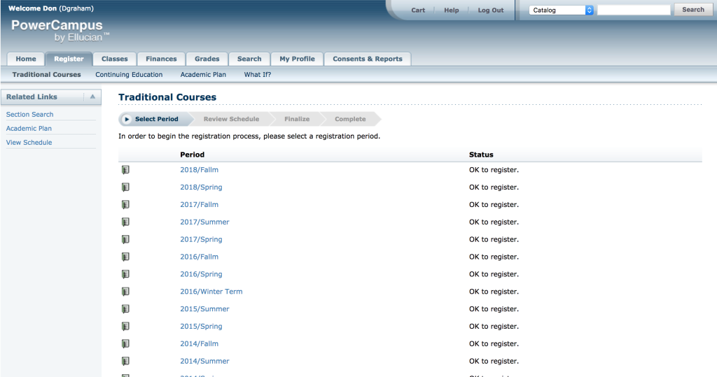
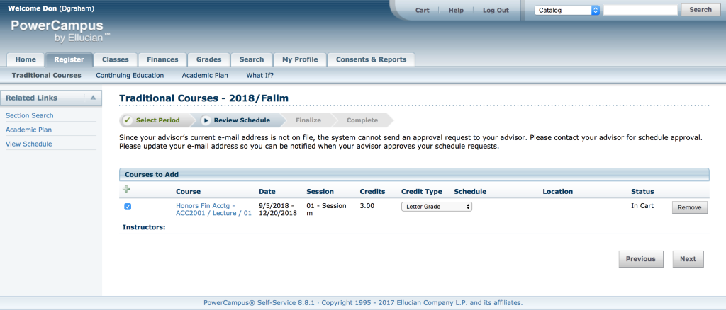
Confirm class selections and finalize your schedule for the next up-coming time period.
A few issues were identified when we were looking to redesign this flow:
- Students were not able to get a holistic view of their calendars while adding classes. In fact, they had to do a lot of prep work PRIOR to their registration period to know what times worked and on which days. They would have to come prepared, which meant in common situations where a student would have to register for something else on the fly (in situations where the class they wanted filled up) this process made it difficult to readjust everything and would have to start over.
- There was a social trend with class registration and students wanted to take classes with friends, and the current experience didn’t allow for this.
Redesigning the registration process
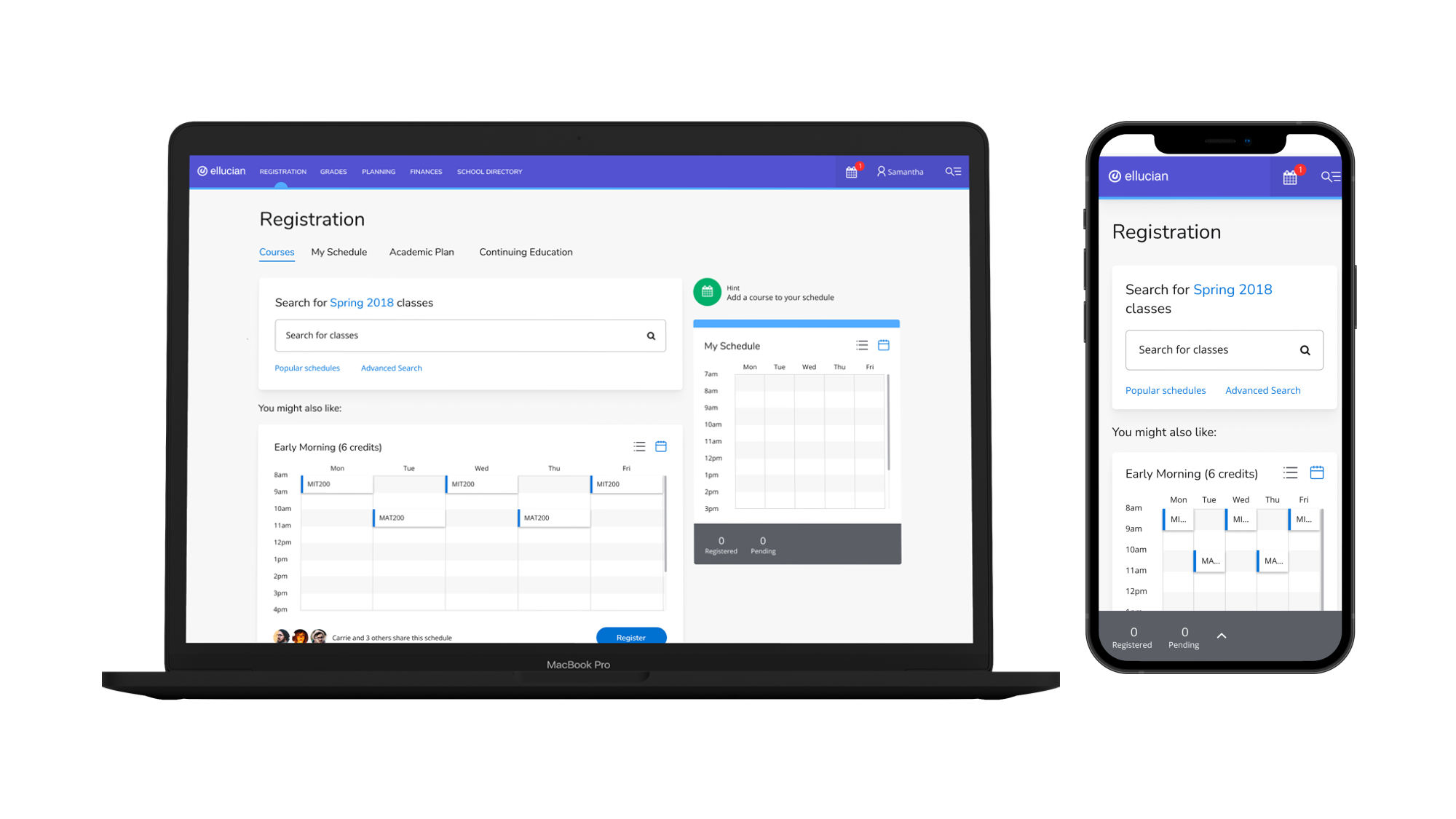
Immediately, we knew we needed to provide students with a calendar that they can immediately view their schedule as they added classes. Their calendar now acted like their original cart, but this flow made more sense since it gave them a holistic view of their next period’s workload.
The initial search experience will also showcase calendars linked to your friend’s so you can register the same classes as them.
On search, the list will auto update and populate related to the string provided. A student is able to add classes according to their needs.
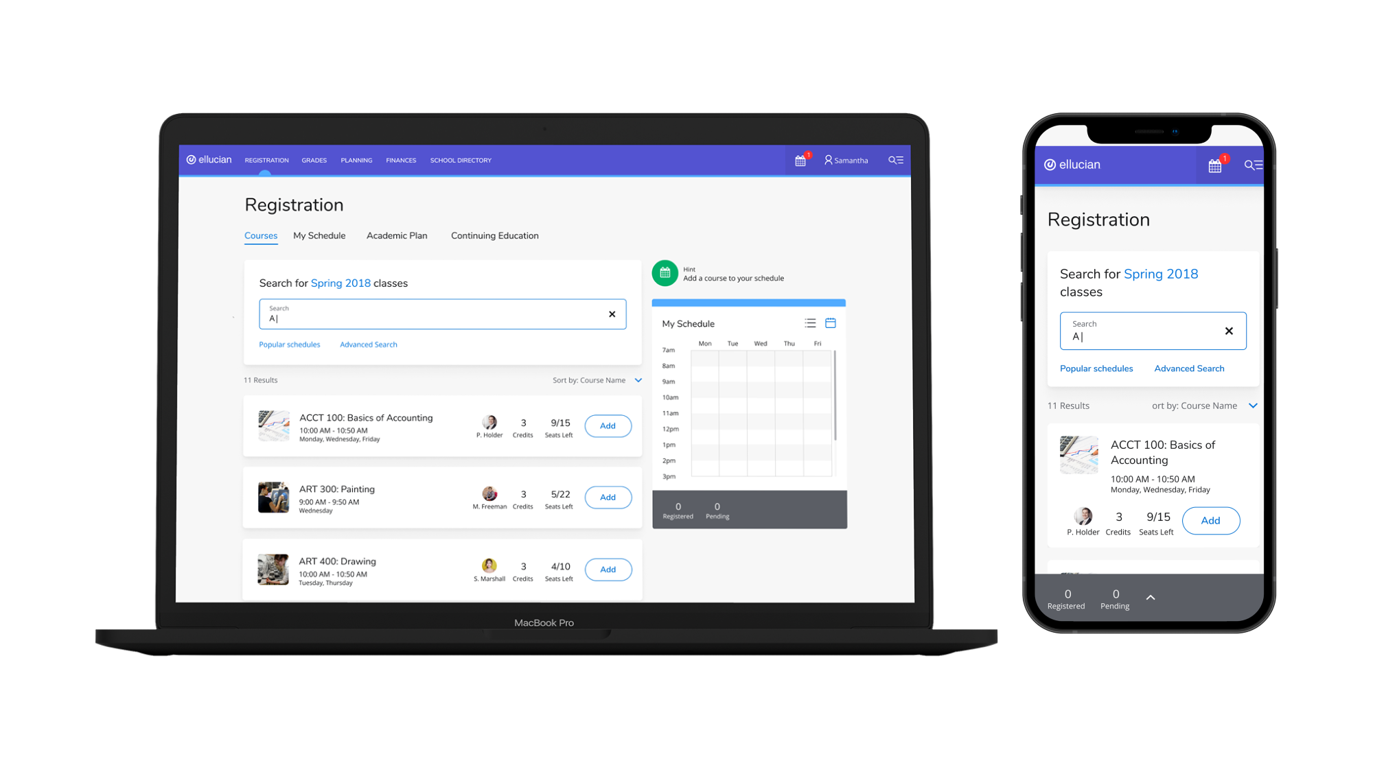
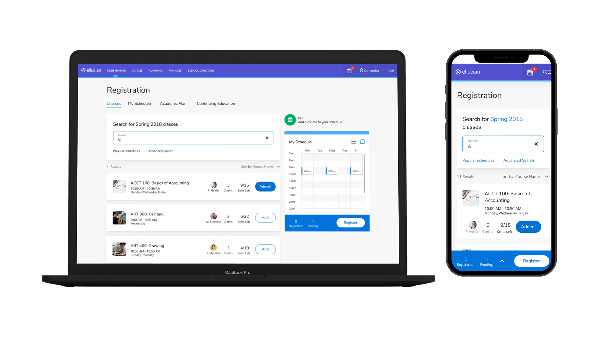
When a student adds a class, it will be immediately present in the calendar. The calendar also changes to a colored bar at the bottom signifying they can take action (register) for their classes.
Tapping the blue bar (even when it’s gray) below will expand the calendar view in mobile. It’s a fixed position bar.
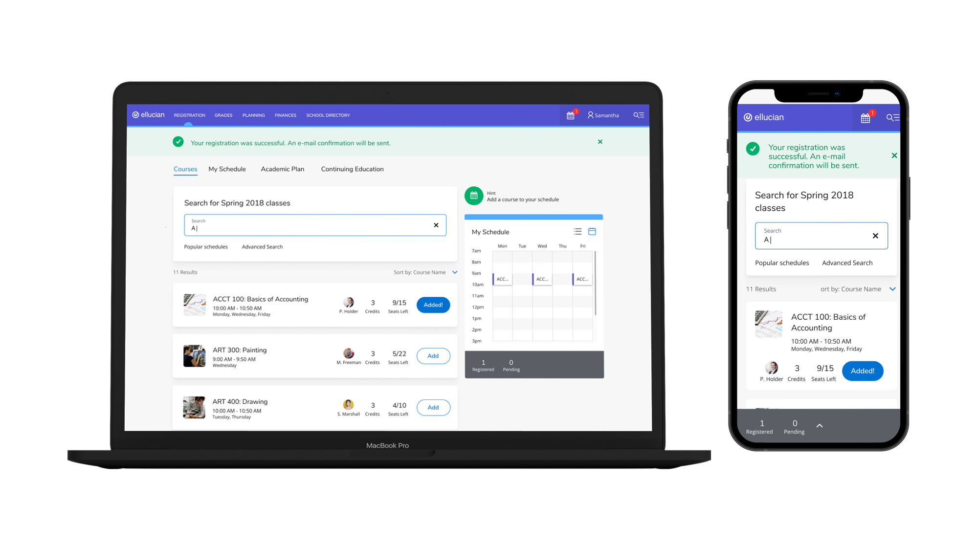
On registration, the student will get confirmation that their classes were registered. The blue bar will convert back to gray, and pending will changed to registered for confirmation.
In conclusion
We launched with the new redesign of Powercampus and we had an extremely positive response from our customers. We redesigned a total of 400+ screens (including responsive views). The project pilot was a success and Ellucian utilized their design system across the board among all their products.