USAID
Tool for tracking global initiatives.
Task
Educate stakeholders of the design process while simultaneously executing on the creation of the tool.
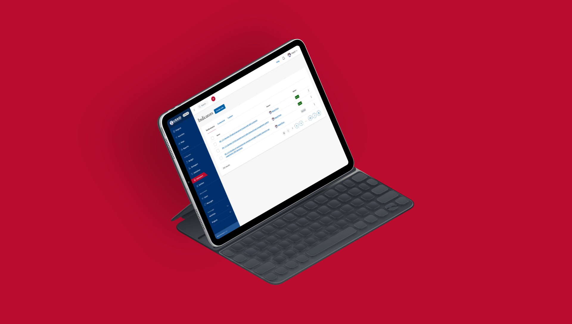
Starting from the beginning
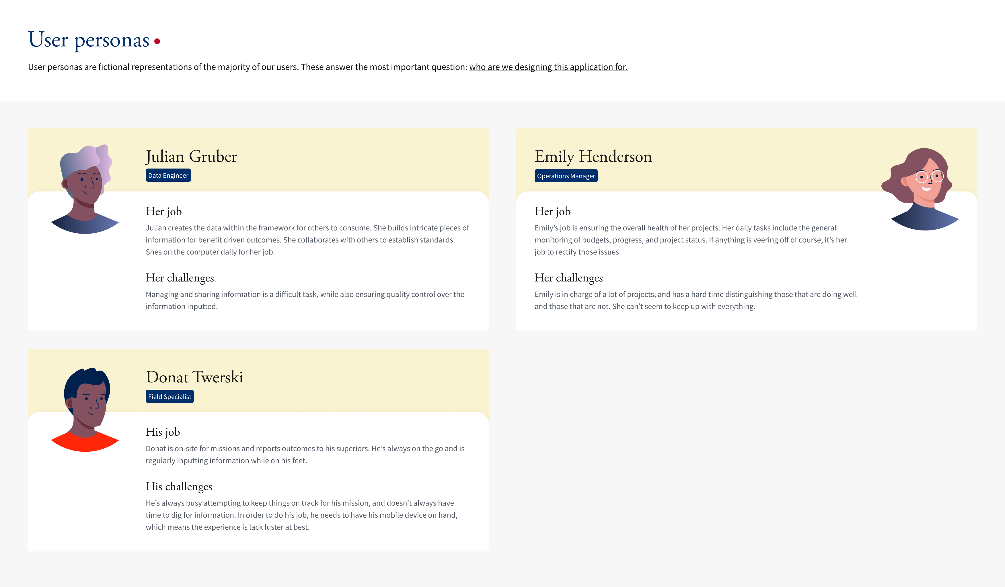
Personas
I was lead designer for USAID’s (United States Agency for International Development) efforts to create a tool that could be utilized by their global initiative representatives. These reps had a variety of responsibilities, each with its own deadline.
To begin the process, I set up interviews with specific individuals and from that, we were able to establish three primary user personas that outlined the majority of representative responsibilities.
Outcome
By simplifying the development process and maintaining straightforward team management, we were able to not only create the tool USAID required, we brought the project in strong and early.
Project management and execution
As lead designer, I managed the product delivery timeline and spoke directly with the stakeholders for reviews and approval. Due to developers having their respective timelines, the calendar was ever-evolving. However, with the right approach and communication, we were able to complete the design work three springs in advance.
Creating a focused experience
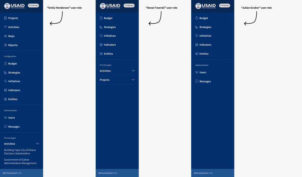
Each persona was crafted to have a set of responsibilities. We measured success by making sure the interface only showed the relevant information and notifications. We tied specific features to each persona, plus additional user role access that could be provided when needed.
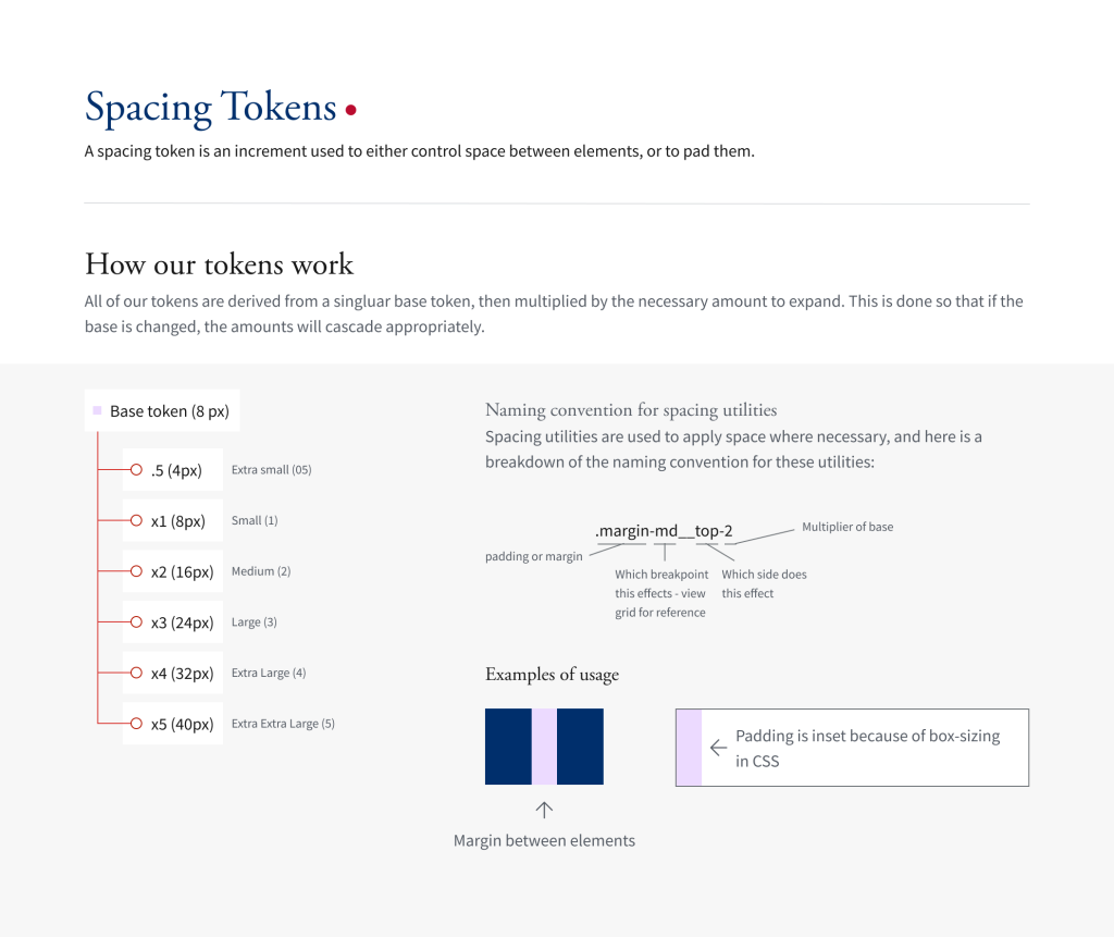
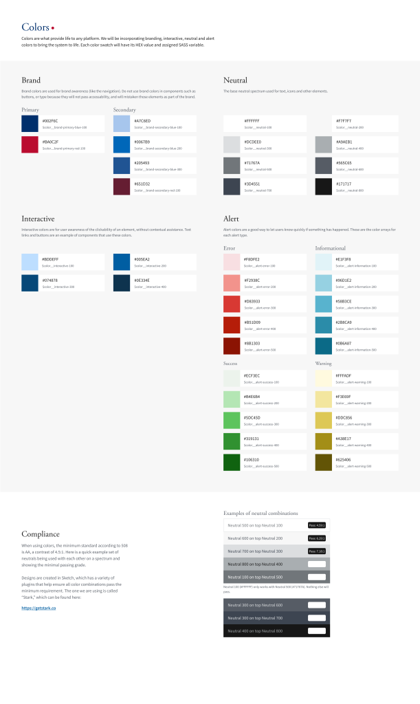
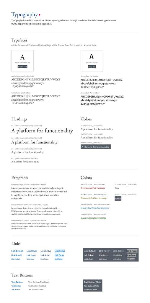
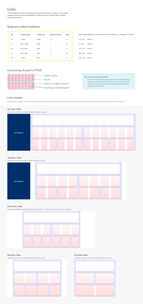
A “simplified” Design System
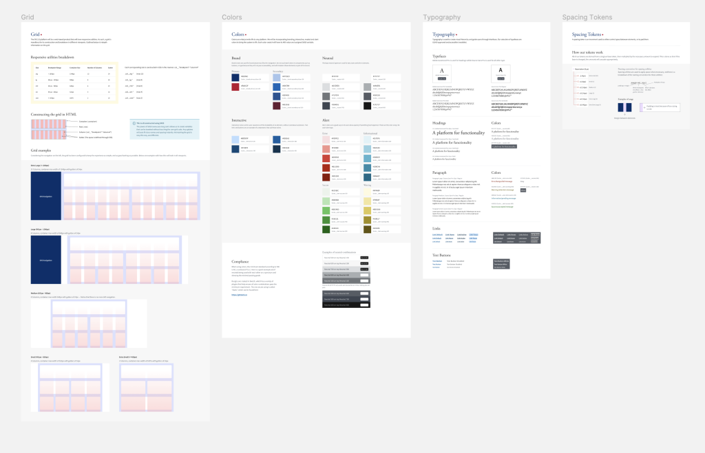
We knew that we could simplify the process by establishing standards within CSS only, as the product would only be web-based (i.e., no native mobile, watch, etc). As such, design token development was not used for this project.
Making complex simple
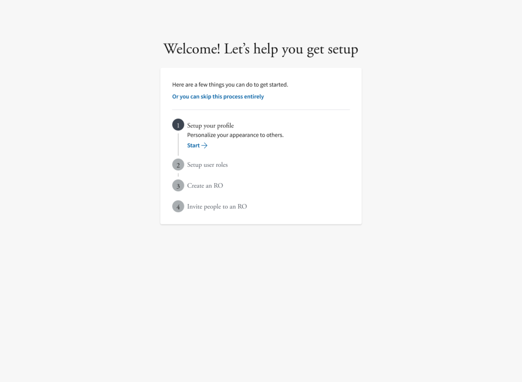
Onboarding experiences should be simple and straight to the point. That way, we can build the in-person experience and ease the process for people who are too busy to keep track of every little nuance.
Templates for all
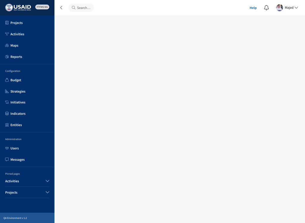
As a web application, we knew how the navigation would behave and collapse in mobile-responsive views. We also understood that page structures needed consistency for readability.
In-depth design system files
Here’s a selection of preview images from the USAID project. These images don’t account for all the work that was done. However, this gives you a nice idea of how development went.
